From looking at Dyer's work we are able to see that our video allows the band to be both ordinary and extraordinary. This is done by making the video lo fi and gritty. It gives the video a sense of authenticity while at the same time it shows them as stars.
This Video conforms to the conventions of its genre as it shows gritty footage to give it authenticity. Also it conforms because it is trying to be anti-conformist. Anti-conformity is a classic characteristic of this genre, making this video infact conform to its genre.
The conventions of indie rock are apparent through the mise-en-scene of the performance. For example the clothes that the band are wearing are that of the indie rock genre. Also the lighting is that of an indie rock video in the performance.
After looking at Goodwins critical framework we could see that many other indie rock music videos were largley based around performance and meat shots of the artists. We wanted to incorpirate this into our video but also wanted a narrative aspect which would be slightly different to the norm of the genre.
We decided to take aspects from the american teen comedy genre and use them throughout our video. The image below is from a teen comedy film:
Our video has strong links with the music and the visuals as the performance is syncronised. Also most of our editing is in time with the music. If the cuts are not in time then we will have placed the clip so that the performance matches the music. For example we have placed the shot of the bassist strumming the string in time with the beat:
Due to the fast paced editing and gritty shots, the audience get a sense of liveliness and rebellion which they would like and idolise.
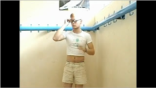
We have tried to experiment with our shots. For example the ball cam shot and the 360 pan. We tried to make it exciting, not just through the narrative and performance its self, but through the camerawork as well. The clip below shows the ball cam shot:
This ball cam shot also uses the notion of looking and gives the audience a first person mode of address.
We have also made the performance in such a way that you feel like you are individually be played to. Also we do do some quick snap shots during the narrative which include the first person mode of address, although they are not long. Below is a small clip of the performance which makes you feel as though you are there at the performance:
This clip also shows the grittiness of the shots which contain strong connotations of the Indie rock genre.
Our video toys with the dominant ideology of men being tough and strong as some of the characters in the narrative are shown to be less manly than others. The image below shows this through the clothes the character is wearing:
Intertextuality is apparent here as our video shows conventions of teen movies, and also a large reference to the film 'Balls of Fury'.
Our video can be considered postmodern because it blurs the boundaries between advertising and entertainment. Our video does this by being something that the audience want to consume and also advertising the bands music to them. Also the video is both stylistic and playfull.
By looking at semiotics we can see how our video shows conflict by creating a table tennis match between two pairs of people. This is representative of our world being constantly at war in some way or another and reinforces the belief that no matter what we do, there will always be conflict. We have created a binary opposition between the two teams.
The brief was to create two print texts, this being an advertisement and a digipak for a chosen band. We have set out to create a cohesive band image to promote the album through using images which we believe show the band in a particular positive light and also ones which would appeal to a target audience.
• The advertisement was designed to run as a full page advert within the magazine NME. This is as we believed the band we are developing these texts for fit in with the genre of other bands which appear in this magazine.
Here are two images from the magazine we wish to appear in, this shows the lo-fi gritty look of the magazine:
• Our advertisement consisted of a collage of ripped out random images of music magazines, polaroids of each of the band members and also pieces of scrap paper with the information we wished to give on the advertisement such as band name and release date for the album. The advertisement conveys many different meanings: • The advert is unique and original but at the same time conforming to the conventions of the indie music genre. This is as the conventions of the indie music genre is being random and this is what this advertisement is. This idea of being random is to be different and very unique from anything else. For example in the Arctic Monkeys music video it shows people dressed up as clowns fighting gangsters. As shown in the image below:
• A convention of the genre is to be rebellious and this is symbolised through our advertisement. This is as the images used on the advert are all ripped out with rough edges with not much care, this can connote rebellion as it could show kids ripping up books at school, and there is no sense of order and conformity to it. • This advertisement fits in with the teen culture which is popular in modern society. This is the culture which has developed from films such as: •American Pie •SuperBad •Role Models These all include kids in America going to high school and being slightly rebellious and foccused on partying. Our advertisement fits in with this as it consists of a cork board with lots of random images on there from popular magazines such as gaming pictures and girls. This can connote a teenagers bedroom as it looks as if it is something which could appear in a teenagers bedroom.
Here is our print advertisement to appear in NME, I have pointed out all of the parts of the advertisement I have commented on (click on image to make larger):
• The digipak conveys very similar meanings to that of the advertisement as the same image is used. By doing this people can make a clear link between the two and notice it is the same band. The front cover has more of a sense of order to it, this is so if someone glances at the album cover they can instantly recognise what the band look like, the name of the band and the name of the album. But at the same time it also fits in with the rest of the texts as it has the cork board background and a border consisting of random ripped out images. This is also the same as the back cover as we wanted the names of the tracks to be easily visable and stand out so if someone knew of a certain track they could instantly recognise it.
Here is the digipak with each bit I have talked about pointed out (click on image to make larger):
• The advertisement and the digipak link in with one another to help construct a band image. Both of the texts are very original and lo-fi. This also fits in with the music video for one of the tracks as this is also very unique and lo-fi. The music video also fits in with the idea of high school teenagers as almost the whole video is recorded in a school gym. Both print texts are postmodern as there is clear intertextual references to popular media such as the films which were mentioned earlier and a mix of boundaries between film, music and advertisement. They are postmodern as they are stylish, stylistic and playful.
• Both print texts link to the music video as they are all postmodern and all comform to the conventions of the indie music genre. The conventions of the indie genre being: • Rebellion • British • Unique • Lo-fi • Gritty • Iconography such as smoking, instruments shown and casual dressing. Here is some images showing the iconography of the indie genre from the band Arctic Monkeys as we believe they are very similar to the band we are representing:
Also the faces of all the band members are clearly shown in all texts. We have done this through meat shots are used in the music video and then polaroids of the faces of all band members are used in both the digipak and advertisement.
• Richard Dyer’s critical framework on the construct of the star image is relevant to all three texts we have created. This is as he explained how ‘star’ images appeal to people and there is two paradox’s and these are being shown as extraordinary and ordinary at the same time. This is relevant to our pieces as the band ‘Give Get Given’ are shown as being both ordinary yet extraordinary. They appear as ordinary as within the music video there is small numbers of them, shown as having a laugh and recording a performance in a small garage but we as viewers believe we should in some way idolise this band and they are shown as being extraordinary. This is through the use of a number of techniques such as low camera angles looking up at the band and they are shown as being very creative and original which gives the band credibility.
• By using Web 2.0 it aided our research as were able to watch a wide variety of music videos of the same genre and of other videos which may influence our own concept on YouTube. We were then able to record our findings on the blog and also embed the music video we looked at on our blog. Also using YouTube we could study music videos which had been made by past years at our school and other schools. We could then get an idea of what sort of music videos we could make with the budget and equipment we had.
Here is evidence of our use of Web 2.0:
• Media technologies have been integral in our planning, construction and evaluation. We used the blog as a collaborative e-portfolio to develop ideas and to record research we had carried out. By using the blog we could develop ideas regarding the music video and also the print texts, we were able to comment on each other posts pointing out what we thought could be improved and what we thought was positive.
Here is evidence of us using the blog collaboratively (click on images to make larger):
• Using Adobe Premier we constructed an animatic. To do this we had to draw out a storyboard consisting of all the shots we believed we needed and record each shot on a digital camera. We then captured all the footage and inserted the track in the audio. We arranged all the shots so they were in sync with the music. This was useful as we were able to see how many shots we needed to use and get a sense of the cutting pace.
Here is our storyboard animatic:
• During our planning we weren’t sure how table tennis shots would come out on the computer and how they would look in slow motion. Therefore we recorded Jack and I playing table tennis on a desk in a classroom, by doing this we were able to capture the footage and view it on a computer. We found that it was quite difficult to see the ball as it was white and moved quickly but if we slowed the shot down it looked far more effective.
Here is the video of the practice shots:
• We developed a pitch consisting of our ideas, costumes and locations; we then presented this to the class. We had to do this to check with the teachers that our video concept was viable and the class believed the concept would work with the song we chose to use. We were then able, by using the website SlideBoom, to upload the PowerPoint presentation on to our blog and then we could comment on this and evaluate how the pitch went.
Here is a screeshot of our pitch on the blog using SlideBoom:
• When shooting we used DV cameras. There were problems which we encountered and we had to overcome these. • To create steadicam shots we used the tripod, this was the majority of our shots. • We wished to use a 360° pan in our music video. To do this we needed everyone to stand completely still and also somehow needed to make the ball look as if it was attached to the racket. We overcame this by using blu-tac to stick the ball to the racket so it would stay. We used a dolly so we could move the tripod round smoothly.
Evidence of 360 Pan:
• We attempted to use some high angle shots and to this we climbed the rigging at the side of the school gym and held up the camera on the tripod. This created a problem as the shots weren’t steady and we couldn’t see what we were filming, once we put these shots on the editing software we realised they weren’t good enough to use in our final video.
• To edit the video we used the editing software Adobe Premiere. This enabled us to capture all the footage we had recorded and sync this footage with the track itself by using continuity editing. Within this programme we used a number of different techniques to enhance our final video. • We put the performance shots in our video into black and white, to do this we lowered the saturation to 0. By doing this we believed it made the performance look both authentic and gritty which fitted in with the genre of the music.
Evidence of Black and White:
• As the shots we recorded were very bright we had to change the brightness and saturation. We increased the brightness and also raised the saturation to bring the colour back into the shots, by doing this the shots became clearer and also looked warmer which is a convention of our music genre.
Evidence of Colour Change:
• We changed the speed of a number of shots. We slowed down the shots which consisted of the band playing table tennis, to do this we right clicked on the shot and changed time stretch and decreased this. By doing this it fitted in with the calmer parts of the track and also the ball became more visable. We then had to speed up some shots so it was in sync with the fast paced music.
Evidence of Slow Motion:
• To create movement in one of our shots we zoomed into the image and created a pan so the image moved left in the screen. By zooming in the image stayed on the screen the whole time.
Evidence of Zoom in and Pan:
• We had to split clips up once we had captured the footage. To do this we clicked on the shot we wished to split and the pressed the ‘split clip’ icon. By doing this we could take parts of a shot we liked and parts of another shot we liked and put them all together to create continuity editing. Also this enabled us to create fast paced editing which added excitement to our video.
• We used a digital stills camera to create two print texts, a digipak for an album of the band we chose and also an advertisement. In Adobe Photoshop we scanned in a polaroid one of us had and then within the programme we were able to insert a picture of a band member over the original image by using different layers. We completed this four times for each band member. For the digipak we then ripped out a number of images from music magazines and placed these on a cork board along with the polaroids we had made of the band members and using the digital stills camera we took a picture for the front cover, inside and the back cover all consisting of different layouts.
• For the advertisement we used all of the same images we had ripped out and the polaroids but added information we felt necessary for an advertisement such as release date and the bands website written on scrap bits of paper. We put together a layout we felt was sufficient for a music advertisement and then took a still photo of one of us holding up this cork board against a brick wall. Within Photoshop we were able to alter the brightness of both the digipak images and the advertisement, we felt felt as if we had to make all images brighter as they came out quite dark as we took the images in the classroom.
• Once we were happy with all the images we could then use Microsoft Publisher to create the final piece. With the digipak we created a booklet with all the correct dimensions and placed the images in where we wished them to be, Publisher was useful for this as it was easy to make a booklet and it is also possibly to set dimensions and see borders of what your working on. For the advertisement we could check that all the sizes were correct for the size of the space in the magazine we wished to advertise in.
Here is how we used Publisher (click on image to make larger):
• To carry out the final piece of audience research we used the website Survey Monkey. By using this we could devise a questionnaire consisting of as many questions as we desired and also whether we wanted them to by open/closed end questions or multiple choice. We could then send the questionnaire to whoever we wanted via e-mail and then people could send their responses back. Using this website was incredibly useful as it was quick and easy to make and the website also collated all the results and put these into graphs and tables which we could then use to compare the results.
Here is evidence of us using Survey Monkey productively (click on image to make larger):
We started off with a focus group to test the concept of our video. We showed an extract from the film 'Balls of Fury' to a small focus group and asked them a series of questions. We did this to try and show our target audience something similar to our own ideas for our video. We played them a clip showing the main character on stage playing table tennis in short shorts and white socks. This was essentially the look we were aiming towards with our concept. The target audience selected for our music video was young, white males. This is what we chose for our focus group and from this we learnt that our concept could be very funny and that it had a lot of potential to turn out the way we had hoped. It was defiantly important to test our concept in pre- production because it allows us to see whether our concept has any potential before we actually begin to make it. Due to the results being very positive towards our concept we were able to continue with what we had planned. Although if this had not worked so well, the focus group would allow us to gain some ideas from our target audience so we could cater more to their likes.
Rough Cut
We showed a rough cut of our music video and of our digipack to the rest of the class to allow us to see if we were still on track with our original concept. The results of this rough cut showed us that we were largely on track with our concepts, however we were told about a few adjustments. This feedback was useful to us as it notified us about some small mistakes which we had made but were unaware of. For example we were told that some of the drumming was out of sync, so after we were then able to correct the mistake.The feedback also gave us an insight as to whether our video would be more suited to ambient or focussed viewing. We could also see if the audience could get the preferred redaing of the text or if they were getting the aberrant reading. The results showed us that they were getting the preferred reading which was very useful information as it meant that we did not need to alter our video so they could get the preferred reading.
The digipack also got very positive feedback. The class were able to guess the genre of the band very quickly and said that it was a very good eye catching product. This for us was essential because it showed us that it was not just us that thought that it is suitable for the genre. The magazine advertisement was also shown and the feedback was very similar to that of the digipack. We learnt that the audience were easily capable of capturing the information shown in a small period of time because the text was big and clear enough. Also we learnt that the text was direct enough and there was no unnecessary text to divert attention away from the important information.
Final Survey
For the final survey we used a website called Survey Monkey to send out a questionairre via email. This questionairre contained questions about are final products and the results tell us whether the audience can still see the preferred reading and most of all, whether they enjoy the video. Overall the feedback we got was good. The questionairres sent back tell us that the video was enjoyable and is open to repeatability which is very important as it could potentially be shown across music channels. People also said that the video was funny which is a very positive comment as that is exactly what we wanted the video to be from the beginning.
This shoot was very similar to shoot 2. Almost everything was the same but we made the room which we shot in lighter. To do this we bought in a plug in light to put at the back of the room, also we screwed in more light bulbs to give more light. The only other problem that we faced was the noise produced. We got various complaints from the neighbours. However the complaints came once we had finished shooting. Other than this the shoot went very smoothly. All of the shots were efficient and quick. We used the same ideas as before so the previous shoot acted as a practice. This allowed us to get the shoot done quickly as everyone knew what to do.
This shoot was very difficult for us because we had problems with lighting. Due to the rest of our footage being very bright and colourful we needed to try and get some sort of match between both parts of footage. The cameara angles and techniques worked well and were able to experiment a little with some camera techinques. One of our problems was trying to cover up a cabenet in the background as it did not match the mise-en-scene that we were looking for. To do this we used a rag which was used to cover the bassists guitar when it is in his case. Another problem that we encounted was trying to set up a mic stand as the singer forgot to bring one. To overcome this problem we hung the microphone from one of the beams in the shed. This actually worked very well in most shots but in some shots it began to swing around too much. Once we captured the footage on premiere we realised that all the footage was too dark. We wernt able to suitably brighten it up as it made the footage look odd compared with the table tennis shots. The only other option that we had was to re-shoot the performance footage again. This meant that we had to do it soon as the deadline was approaching fast.
Our first shoot was to film the majority of our music video, the table tennis shots. These are the problems we encountered and how we overcame these problems: • Our first problem was putting up the table tennis table as it was brand new. This took just over an hour, so we then had to loosely put it together so it stood up then start filming as this time was eating into our filming time. • Within the school gym there were a lot of mats put together which we had to adjust for the mise-en-scene as the gym would look very messy. • The light was shining very brightly in the gym so we had to choose the areas we filmed in very carefully otherwise the shots would be too bright. Also as the day went on the sun changed position so the brightness of shots varied, something we would have to adjust in editing so they all matched each other. • We needed to carry out a 360 degree pan which needed all members to be still and we also needed to attach the ball to the racket. To do this we had to put white tac on the ball to attach it to the racket. We decided to use white tac as it was the same colour as the ball and hopefully wouldn't be noticable. • The filming turned out very different to what we first anticipated. We included many new shots which weren't originally storyboarded such as the shot of the fan sliding on his knees and the smashing up of the table tennis table. We did this becuase we needed a wider variety of shots not just shots of the members playing table tennis.
I have studied and looked at many auteur videos throughout this term of us developing our ideas. None of them directly have changed our ideas regarding our music video as we had a fixed idea of what we wanted in our music video and knew there wasn't any other music videos similar to ours. Even so I still found them extremely interesting and inspirational, these are videos made by some of the biggest bands on the planet such as Radiohead and use some of the most experienced directors. These include videos such as Radiohead-Street Spirit and Aphex Twin-Window Licker. By studying videos such as these it has prooved to me that music videos are most definatly and should be considered by everyone as being a piece of art.
After showing our pitch to the class we have realised that we can potentially face more challenges than we thought. However our idea was said to be good and was cleared. Our feedback told us that our idea had alot of potential but there are a few things that we have to do in preperation for storyboarding and filming. For example we needed to film pratice shots of the table tennis ball so we are then able to see if it will work as well as we had planned. Also we needed to test the quality of the slow motion shots using the school cameras as we were not sure if it would remain in good quality. However our ideas of costume and locations had very good feedback and we do not need to work on this anymore. We were given some ideas of how to shoot the table tennis effectivly. For examlpe we can film different table tennis shots in any order and them put them into an effective sequence so it looks as though a continuous match is being played, rather than trying to film a continuous match and just rely on our skill. Overall i think our pitch covered all aspects of the video and the feedback that was given will enable us to shoot the video more effectivly and effeciently giving us a better final product.
For my music video deconstruction I have decided to do Flobots ‘Handlebars’. I have chosen this because I think it has a very interesting video and it portrays very interesting messages. The group probably belong to the rap genre more than anything but they do have a link with the indie genre as well. The video is all narrative although it is done using animatics. There are no real life shots involved it is all in cartoon. The notion of looking is used however as we can see the two cartoon characters faces through a mobile telephone. There are also very obvious strong links between the lyrics and visuals. For example when the song lyrics say, ’I can ride my bike with no handlebars’ for the first time it shows the two characters riding on a bike with no handlebars. These kind of strong links appear often in the video when something similar is ever mentioned. Also the editing is timed so the different shots cut in on the beat of the song. Using Goodwins critical framework I am able to distinguish the style of video this is. I have found it to be an illustrative video as it portrays most of what is being said in the vocals through images. This is done to allow the audience to gain a clearer understanding behind the meaning of the song. This video could certainly be considered art due to the way that it has been created. The ideas presented through the song are about human beings having so much potential to be destructive or to be creative. It is about how tragic it is that Americas appetite for military evolution is endless. However when it comes to taking on a project like ending world hunger, it is seen as outlandish. It is not treated with the same seriousness. This makes the video very post-modern as it is not just an advertisement for the band but it is an advertisement for a protest against the government. This video directly challenges the government thoughts and ideas very openly.
Media Language
The visual techniques used in this video are very interesting and different for a music video. This is because the video is animation. The camera shots are full of motion. Almost each different shot in the video pans around or tracks in and out. The motion is usually sped up in between different distances of shot. For example there is a MLS of a crowd and then a sped up shot of the camera tracks through the crowd of people to a MLS of a woman and a man. The camera then tracks forward again to a MCU of the woman sitting on the floor. This constant motion of the camera add to the energy of the song and it contributes to its influence because adds to the connotations of witnessing different horrors within society. The editing is time in a way so that the shots change in time with the underlying beat of the music. There are very many intertextual references to culture within the video as it shows the paths of two different people. One person is shown to be walking though a poverty ridden area whilst the other is seen to be walking through a wealthy area.
Representation
The band are not shown at all through this music video so it adds a very strong sense of mystery to them which is very appealing I think. There are two social groups which are shown in the video. One group is seen to be very poor working class, however this group is seen to be kind, friendly and innocent. This in in contrast with the wealthy people shown who are seen to be vicious, spoilt and cruel. This idea reinforces the underlying meaning of the song that the wealthy people are too power hungry and are neglecting the real issues in the world such as poverty. This also reinforces the tension between people due to socio-economic status. However gender, age and race are not referenced very much at all during this video. I think that the governments dominant values are being challenged by the peoples values and beliefs are being reinforced in this video. I believe that the artist has done this to instil their beliefs into the listeners and get a powerful message through to their audience subtly.
Institution and Audience
I believe that this video can be consumed through focused and ambient viewing. However I think that people will watch this video in a more focused environment because of its intriguing visuals. Also because it is a protest song the focused viewers will be interested to see how they portray their views through imagery. The record label I believe will not have very much say in what the artist wants from the video. Due to the songs nature the band will probably take control and put in what they want to emphasise their message as powerfully as possible. The song is anti conformist so it would be hard to see them being controlled in this way by a record label, especially with their rebellious persona.
Our video is going to consist of far more narrative than performance. The narrative however will only need to be shot in two different locations. A changing room and a gym. For this narrative sequence we tought that the school gym and changing rooms would be perfect. this is because they look quite run down and old and this is a contrast to our mock table tennis match where the players are taking the game very seriously. For the performance aspect of the video we have decided to shoot it as if it was an intimate performance. We thught that my shed would suit this very well as we will not need alot of extras and we should still be able to make the performance look crowded and very energetic. These images of the gym are exactly what we were looking for and the gym is big enough for us to experiment with different camera angles and shots to improve our video. Also because it has a long row of windows it allows alot of light in which adds to the overall look of bright colours that we are going for. These shots are of my shed and once we have cleared everything out for the performance aspect of our video it should look how we wanted. there is space for us to put lights in and also thelight bulbs at the top add to the gritty effct we are looking for in the performance. if we shhot this in the corner of the room the performance will look ver energetic and crowded.
The video ‘Fluorescent Adolescent’ by Arctic Monkeys, an alternative rock band, is one which is based on a narrative rather than the performance of the band. The narrative consists of a gang of clowns and a gang of gangsters fighting at an abandoned warehouse, with the two leaders, past friends, attempting to kill each other. The genre of this music track is made evident through several conventions of indie music videos. The lighting used and also the location, an abandoned warehouse, give the music video a very gritty British feel and makes it clear it is a low-fi music video. The music video ‘Fluorescent Adolescent’ is an example of disjuncture between the lyrics and visuals. The video does not illustrate what the lyrics are saying as there is no talk about a fight between a group of clowns and gangsters. They have done this to make the music video unique and stand out when people are browsing through the music channels because of the bizarre concept for the video. This music video could easily be considered as a piece of ‘art’. This is as it is very stylistic with the use of lighting and camera work, and could have even been an extract from a film apposed to a music video advertising a band and their work. This video is postmodernism as it has blurred the boundaries between a music video and a short film, as subconsciously we as viewers are being shown an advertisement trying to promote a band or song, but we consider these music videos to be pieces of art in a way we would with a film. We do not realise that this music video is an advertisement as it is not inherently commercial as it offers a very unique idea, one which is very different from the rest of the market. This creates a new type of media which has not been seen before.
Media Language
At the start of the music video a POV shot is used which positions us on the side of the clowns. Throughout the video a handicam is used following the action closely, this makes the viewer feel like they are actually involved with the action which creates a bond between the band and the viewer. The viewer is often placed in with the action such as when the gangster is smashing the windscreen of a car with a chain the camera is placed within the car which makes it feel as if he is attacking us. This feel is also created through the use of MCU shots at eye level as the viewer is able to see everything which is going on. The lighting and colours used are common in indie music videos, these are yellows and greens which give a feeling of warmth but makes the video look very gritty and clearly British. Slow motion shots are used throughout this music video such as when one of the gangsters attempts to hit a clown with a chair but misses and it smashes on a pillar. By using these shots it creates a contrast between the fighting scenes and the scenes with don’t involve fighting. The speed of the editing stays consistent throughout the video, not often speeding up or slowing down. Even when the music becomes livelier the editing does not match this. There is no link between the lyrics and the editing but instead the editing is linked with the music, often changing shots as the music changes. At one point in the music video the camera looks up one of the gangsters swinging a chain, this begs a question, are we meant to idolise these people through the violence they are carrying out? It is clear that the leader of the clowns and the leader of the gangsters have a history together, even after 25 seconds over shoulder shots are used from both perspectives as the two are squaring up. Later on in the music video a POV shot is used from the viewpoint of the gangster leader as the leader of the clowns is punching him. During this shot text is used to anchor the image which reads ‘How could it have come to this?’, this clearly shows that previously these two were good friends and how possibly could it end up in them fighting. This creates an enigma for the viewer as they wonder what happened between the two of them. A question which is not answered in the video but is left to the viewer’s imagination. Straight after this sequence the video cuts to a clip of the two boys as youngsters on a swing, with the clown still dressed as a clown the viewer can make the link between the past and the present. This shot is faded in after it shows the face of the clown so it gives the sense that he is reminiscing back to the old days. After the clip of the two youngsters on the swing there is a sequence of still photographs of the band members when they were younger enjoying themselves. This shows the contrast between childhood and the adolescence and young adult years as they are now carrying out acts of violence in large gangs. This music video ‘Fluorescent Adolescent’ is extremely low-fi with the absence of any special affects or anything more than a simple colour change. This is a video that could be made on a very low budget. The mise-en-scene used helps to add a lot to the music video. The music video is carried out at an abandoned warehouse next to a river which helps to add to the gritty feel of the music video. By using this location the colours seen in the majority of the music video are greys and greens, this making the video very gritty and British. With the use of mise-en-scene it is evident that this is taking place in a large city, this is as when the clown is throwing a man in the river in slow motion large buildings and tower blocks are seen on the horizon. At the very end of the music video the clown leader is shown blowing up the car with the gangster leader still inside of it, then the video cuts to a flashback of the two men as children dancing around in the sunlight. This creates a large contrast between a childhood and adulthood. The actor Stephen Graham is used in the music video ‘Fluorescent Adolescent’ who is a very popular actor and appears in films such as ‘This is England’ which is a very gritty British film which also involves violence. When viewers then see this actor they think of the roles he’s played and in what sort of films and they automatically link them to this music video.
Representation
From this music video ‘Fluorescent Adolescent’ the band Arctic Monkeys are represented as being very creative and original. This is as the concept of the music video is very different, one which has not been done before, so therefore on a larger scale this could mean that they are like no other band musically. The band do not appear in this music video, this shows that they do not need to advertise themselves in a music video to gain recognition. This to a viewer who has never seen or heard of the band could show that they must be quite a big band and even credible if they do not feel the need to advertise themselves to get fans but let the music do the talking. This could add to the meta-narrative of the band Arctic monkeys as being a credible band, as they have also used a large actor in the music video, and shows the band as clearly being British. This can help sell their product as the band are represented as being credible, very creative but still, with the use of a gritty video, shown as being normal guys. The different social groups shown are young adults who are represented through violence and shown in a negative light in contrast to when they are shown as youngsters who are pictured enjoying themselves. This clearly is used to represent a wider topic in society of the change between childhood and adulthood. Within this music video there is an ideology on male ego and pride through violence and standing your ground. This is as there is no females present in this music video but a bunch of men, some being a lot older, carrying out organised violence. This shows the two groups fighting for pride and is not shown fighting for an object or money. There is also an ideology regarding childhood and adulthood. This shows the change, from when a child is young and innocent out playing to a young adult taking part in violence and holding hatred against other people. This could be reinforcing a view in society of how children change for the worse as they go through their adolescent years. Using Dyer's critical framework on 'Stars' it is evident that the band have used this video to be shown as both ordinary and extraordinary. The band are shown as being ordinary as the video has a very gritty and British feel as apposed to using CGI and other post-filmic effects. But they are shown as being different and extraordinary, people who we would admire, with the use of a very famous actor playing a large part in the music video and the general concept of the music video being very unique.
Institution and Audience
The music video ‘Fluorescent Adolescent’ would be aimed at more focused viewers as apposed to ambient viewers. This is as there is a slight narrative throughout the music video but viewer, if an ambient viewer, would not understand the past between the two leaders and why they were fighting. This video would be mainly used to appeal to their fans rather than to gain many new fans. This is as the band have not appeared and advertised themselves in this music video as their current fans would already know what they are like and what they look like and also shows them as being unique and original. The band Arctic Monkeys belong to EMI who are the fourth largest business group regarding record labels and also Warner distributors. Therefore they would play a large part in these promotional texts as these are big companies and the band are also representing these companies so they would want to be shown in a positive way.
Yesterday we carried out our focus group. At the start we gave out questionnaires to the group to fill in, and then showed them a clip from the film 'Balls of Fury' and finally had a small discussion regarding ideas. We found from the questionnaires that the indie genre was very popular wish gives us an idea of the target audience we want to appeal to when making our music video. One of our questions asked if the respondant could think of any music videos which made them laugh and only one music video was suggested between four of them. This shows that what we are attempting to do is very original and probably would stand out from a lot of other music videos. We found that the most popular films with comedy similar to what we are attempting to do were Anchorman, Step Brothers and Superbad. But we found that Balls of Fury was not so popular, but some of the respondants had not seen the film. This means that we may have to carry out the table tennis idea differently to how the film Balls of Fury does it. Included in the questionnaire was a picture from the film of Balls of Fury of two players playing table tennis, all resppondants said they would find this idea funny as it had not been done before in a music video but it had to be executed well. We wanted to find out how the band would be represented if we attempted to make a music video like this. We found that they would be represented as funny, creative, original and credible. This is a very positive thing as these are what we wanted the band to represented as. We found that the most popular comstume idea we came up with was one which consisted of a head band, glasses, t-shirt, shorts and sweatbands round the wrist. We then showed an extract from the film 'Balls of Fury' to see if people found it funny. This extract had a positive response with everyone finding it funny, this shows that our video, executed in the right way, could be amusing and appeal to a wide audience. Finally we carried out a small discussion to finish off the focus group. We put forward the challenge we faced that none of us could play table tennis to a high level and how we could get round this problem. One of the respondants suggested that we put the ball on a piece of string with someone holding it moving it from one side of the table to the other, this would also add to the comedy of the video as it is clearly fake. From the discussion we also found that for the costume it would be best to dress and act as geeky as possible wearing short shorts, skimpy vest, long socks and sweatbands. We proposed the idea to the group of using the school gym as the location to carry out the music video, the response to this was positive as it is quite a run down gym and would add to the comedy of the video. Overall the focus group has helped us to develop our idea and give us an idea of what to leave out and put in, we found that people would find our idea funny and thought it was original, but this is if the video was executed in the right way.
As we already had a strong idea of the concept for our music video we decided to test our idea to our recipients rather than using it to try and develop a concept. We will ask them about films which have similar comedy to what we are trying to do, including Balls of Fury, Step Brothers and Superbad. We also wanted to test how the band would be represented if we did make a video like this, because the band are unsigned and could potentially use this as an advertisement we need to make sure the band are represented in the right way. We have decided to carry out a focus group containing 4 people, aged 17-18, as this is the target audience for the band. Within the focus group we are going to tell them about our initial idea for the music video and see what there response was, and also show them a bit of the film 'Balls of Fury'as this contains comedy foccused around table tennis. We can finally have a quick discussion and listen to ideas which the foccus group have, things that we could change and things that we could add.
This picture is from a film 'Balls of Fury'. This film is a a comedy about table tennis and so it could give us some very good ideas. This picture shows a look similar to the one we would like to go for.
The Kooks- Naive http://www.youtube.com/watch?v=r-KnNVoFsCc
From carrying out a technical analysis of this music video i learnt a lot which can help Jack an I when making our own music video. It is clear from studying this video that a lot more shots are used for example in a three minute music video than a three minute opening to a film. Therefore we need to bare this in mind and make sure we capture a large variety of different shots and a lot of them. The video 'Naive' by The Kooks shows an example of a video which we could easily make ourselves. This is a very British video and extremely low-fi. The editing in this music video is very slow paced with a lot of shots in slow motion. This is useful as in our own music video we plan to use slow paced editing in parts with longer shots and especially slow motion shots of CU's of the artist. A steadicam is used throughout this music video and there is very little evidence of a variety of shots such as tracking or panning shots. Within this music video there are a lot of shots showing the artist and the majority of these being CU's or MS' to establish the artist with the audiece, which is also done with CU's of the artist lip syncing to the camera in the first person mode of address. All through the music video there is a repition of the shot of the artist walking through the club looking about which is slowed down. This is useful as there is going to be a lot of time to fill in the music video with a lot of shots so therefore by repeating a shot the video becomes more recognisable to an ambient viewer and fills the time well. When studying this video I noticed that no transition effects or any special effects are used, apart from maybe a yellow wash which makes the video look very warm, gritty and British. No transition effects are used as each shot just cuts to the next and with the lack of special effects this is a video which Jack and I could easily learn from. This is as it has clearly been made on a low budget which is the same as us and also the genre of this track is very similar to the genre of the track we are making a music video for.
Technical Analysis Evaluation: 3oh!3, ‘Don’t Trust Me’. Jack Clark
Although this genre of music is very different to the type of music we are doing, I feel that we can gain a lot from one of the sequences within the video. As our video is going to be a mock table tennis match, I analysed the sequence in the video when the two performers are in a mock wrestling match. There were not a vast amount of shots used in this sequence, however there were lots of jump cuts to allow the visuals to flow with the fast pace of the track. The fish eye lens was used for most of the visuals, however when the shots cut to different performance aspects of them the fish eye lens is not used. There is only really one camera shot used which is a MLS however the artists move closer and further away from the camera in its fixed position. There is only some movement involved which was a small pan up to keep the first person mode of address within view. There is a yellow filter used over the top of the footage to give it a bright and warm feeling during the wrestling.Also the brightness jas been turned up to increase the amount of light seen within the sequence. The shots cut back and forth from the wrestling sequence to MCU’S of the two performers lip syncing into the camera in a different environment. Only a steadycam was used in this sequence as the shots were very still and the was no shaking of the camera. By looking at this video I have thought that some performance aspects could be used during the table tennis match. Also that the fish eye lens could be a very effective look for the shots. I have also learnt that not using lots of different shots can be very effective and that the performance could keep the tempo of the song apparent in the visuals.
Together as a group we previously came up with an idea for the music video. The orginal idea was to use POV shots for the majority of video following the 4 band members through the day and then finally meet at the end of the video for the performance. But we decided there would be a lot of different locations we would have to use and a lot of filming if we were to follow all four band members through their day as obviously they would all have to be doing different things. Therefore we have changed our idea. The new idea is to a carry out a humerous table tennis match. This will consist of the players coming into a gymnasium like a boxing fight with a gown on over the top of a comedy outfit of short shorts, long socks and a vest. The idea is that the band will perform and act like this is a very serious match and there will be people watching. A lot of slowmotion shots will be used of the players getting rallied up, such as water being poared over them, slapping them in the face and getting physched for the match. We believe this is a very oringal idea which would be possible to carry out as it only takes place in one location and we have a number of people we could use in the video including the band themselves as the main players. We could also put some performance shots in there of the band performing in Jack's shed as filler shots so the viewer is able to establish who the band actually are.
Together we have come up with a number of places we wish to carry our a reccie and could possibly be used in our final music video. These are: 1) The school gymnasium 2) Jack Clark's Shed 3) St. Johns Sports Centre
We managed to learn a lot from the trip to Brighton, mainly from our own mistakes. Our attempt to carry out the sped up shot of the performer in a crowd did not come out the way we hoped it would. While the camera was filming us we were also moving quite a lot as the people walked past. This also speeded up our movements a long with the people walking past. If we do choose to use a shot like this in our final music video we would have to stand perfectly still for an extended period of time for the shot to be effective. Also a lot of our shots came out quite shaky when we captured them. So in the future we will have to use our tripod to enable us to keep the shot steady rather than using handicam. During the trip to Brighton we found some very promising locations that we could potentially use in our final music video. This is as Brighton is a very diverse place with many different types of locations, and very British looking locations which would be ideal for an indie music video. It was very helpful using the cameras once again after a year and I believe it was important to get this practice in so we can learn from our mistakes before we carry out our final music video. It was also good to refresh our memories on using the editing software Premier, which will come to good use when we come to editing the final piece as we will have prior knowledge. It was important for us to get a reality check of how good the cameras where and what equipment we have to work with. This as we can understand what we could possibly and not possibly do in our music video on a very low budget and a lack of equipment.
From putting together this mood board i did learn several things which may be useful when putting together our final music video. The colours used within this genre are very gritty looking, with the use of yellows, black and greys. There is also a pattern regarding the clothing the how the band look. They are often dressed casually, in jeans or skinny jeans, a jacket and fairly long hair. There is also some iconography present such as smoking, which would make the video look very gritty and British.
The genre of the band and the album is not evident from looking at this advertisement for the album ‘Journal for Plague Lovers’ by Manic Street Preachers. This is as there are no conventions of a rock band on here such as showing the band themselves. The way in which the genre could be known is by what magazine the advertisement is in, in this case the magazine Q. This shows that this band is probably going to be a rock band or something very similar. The main part of this advertisement consists of the album cover in which it is advertising. The image used on the album cover is an original painting by Jenny Saville. This is a painting of a young boy staring slightly to the side with blood covering his face. This painting would have been used for a number of reasons. Firstly the painting is very striking and connotes child abuse which is a very sensitive topic within society and when used in a magazine it instantly catches the reader’s attention. Also the album is comprised of all songs written by Richey Edwards who was their lyricist but disappeared in 1995. This image could also have a link to his death and represent his death. But the interpretation of this advertisement largely depends on the person viewing it as someone who wasn’t a big fan of the band would not make the link between the picture and Richey Edwards whereas a fan of the band may do. Everything else on the advertisement is very plain and small in comparison to the image. This would have been done on purpose as the image would be seen as the most important part as that is the bit which first grabs the attention of the reader. The name of the album is ‘Journal for Plague Lovers’ which could have certain connotations. ‘Plague Lovers’ could mean people who are so in love it could be called a disease and it is like a diary of these people. All the text is either in black or white which are very neutral colours so they don’t stand out too much on the page. The band name and the album name stands out more as it is in white at the top of the page and is over the boy’s hair which is black so they are contrasting. The other information given on the advertisement is the release date of the album, who has done the music, produced and the lyrics for the album, in what way the album could be brought and also the bands website. The bands website is vital as people can go on here to find out more information about the band and the website would also contain information about other albums and tours. The band ‘Manic Street Preachers’ may be represented as quite a deep and political band from looking at this advertisement. This is as the subject of child abuse is shown which is a large talking point within society and this band may be shown as tackling this issue. This makes the band seem more credible as they are singing about political and social issues which also makes them different from other bands. This also helps the band sell their product. Using Dyer's crtical framework on 'Stars' it is evident that band want to use a range of different materials to construst their star image, this being through a magazine advertisement. By doing this and using the image they have it makes the band feel both ordinary and extraordinary at the same time. It shows that they want to tackle common social issues but as a band makes them maybe look more credible as apposed to some other artists. This advertisement would be consumed very differently depending on who the consumer was. This is as child abuse is shown in this advertisement which is a topic in which everyone has different views and opinions. It also depends on how much the viewer knows the band and who they are or if they are a fan or not.
The genre of this band and the album is evident through a number of conventions of punk rock. One of these conventions is showing the artists themselves on the album cover and also in the state these artists are in. They appear to be heavily intoxicated which is largely linked to the punk rock genre. The visual techniques of this album cover help convey different meanings which can be interpreted differently depending on whom is looking at it. The rule of thirds is used on this album cover to place the artist’s faces at the start of the dominant reading path. By doing this it focuses the viewers attention to the artists straight away which shows the album will be largely about them. The lighting used creates a large contrast between black and white, which makes the artists seem pale skinned and their hair very dark. This creates a gothic look of pale skin, long black hair and very red lips. From looking at the artist on the left hand side it is clear that these men are intoxicated in some way. The idea of rebellion is used throughout this album cover with the use of iconography; starting with the way the artists look. Tattoos on both of the artists are on show, one of these being a skull and cross bone which connotes rebellion. The artist on the right, Pete Doherty, is pictured with a cigarette in his hand which also ties in with the rebellious look. The way the artists are dressed makes them seem very ‘normal’ and accessible. This is as they are not dressed in anything special; one is wearing the vest and the other an open-buttoned polo shirt, so therefore they appear as normal lads. Drugs are largely related to this band and especially Pete Doherty, on this album cover Pete Doherty looks as if he is passed out which could connote he may be on drugs and plays along the perception everyone would have before hand. The two band members are also very close together which could signify that the album is about their relationship or a lot to do with their lives and what they do. The letters on the album cover stating the band name and also the album name are not in a straight line and have no order which could connote rebellion and also the use of black and white. The word ‘libertine’ itself means someone who ignores accepted morals and behaviour so it is clear that the band are rebellious and want to be seen in that particular way. The way the band is represented in this album cover adds and conforms to the stereotype of the band and their ‘meta-narrative’. This is as everyone believed they were outlaws and were largely related to drugs. This album cover denotes Pete Doherty passed out with a cigarette in his hand and both artists looking intoxicated in some way. They are also shown as normal lads which make them accessible to their fans and others as they can relate. This helps to sell the product as people believe they are investing in a real band as apposed to a completely commercialised one and also by showing the artists in the way they are people can relate to this and see a sense of normality in them which the buyer can relate to. Using Dyer’s critical framework on ‘stars’ it is evident that the band are being made out to be ordinary, through the clothes they are wearing, but there is something about them that make them seem extraordinary which appeals to people. This is as they look they have been out or are out and having a good time in some peoples eyes and shown as being able to live a normal lifestyle of going out but also live the life of a famous artist. This album cover could be consumed very differently depending on who is consuming it. Someone who is older and has not experienced the current youth culture they may look down at the artists and say what example are they setting for youngsters etc. Whereas someone who is part of the current youth culture may think these artists are ‘cool’ and perhaps idolise and see them as role models. The target audience demographic would be between the ages of 16-24 which is an important time in which people discover things about themselves and are also caught in this youth lifestyle.